• supporting creativity in the classroom and beyond •

• supporting creativity in the classroom and beyond •

intersecting math and art


The art lessons I teach are based on the elements of design, and many incorporate math in some way, especially geometry. When I ask students to tell me what they notice in works by Wasily Kandinsky or Pablo Picasso, many of the responses include words like square, triangle, line, acute, obtuse, parallelogram, isosceles, and other math words. Any art lesson that includes the creation, manipulation, and use of different kinds of shapes and lines, whether students are drawing, painting, or making collages, is likely related to math. Here is a review of a few of my favorite art-making activities with math connections:
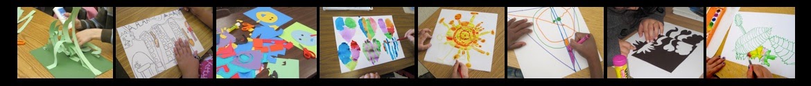
Geometric People
These figures are created entirely from geometric shapes (mostly rectangles). The lesson includes a discussion about joints, human body proportion, length and width, and the depiction of movement. A great introduction is to look at art by Keith Haring and to do a movement activity that requires students to arrange their bodies in different poses. For this lesson I really encourage students to create their figures to show or imply movement.

Geometric Shape Collage
This works with students of all ages, with directions that change according to the age group. Younger students are asked to use one circle, two lines, three triangles, and four colors; older students use one circle, two lines, three non-congruent triangles, four different quadrilaterals, and five colors. The finished art work can be used as a jump-off point for more math practice, with computation, calculating perimeter or area, or other math practice.

Kandinsky-Inspired Abstract Design
This is adapted from an activity in the book “Drawing With Children” by Mona Brooks. I usually have students look at a Kandinsky print and tell me what they notice. Invariably, math vocabulary bubbles up:  acute angles, triangles, parallel lines, etc. Then I have them draw one thing at a time, starting with three dots anywhere. The drawing directions use tons of math vocabulary (parallel, perpendicular, larger, smaller, etc.) They asked to color it however they choose, leaving part of the composition white. These are always successful, colorful, and interesting!

Cityscapes With Symmetry
This drawing activity connects to mathematics with its focus on symmetry, proportion, and a little work with geometric shapes. Students can be creative while applying their knowledge of symmetry. I like to use construction paper crayons on black paper, but I’ve also used regular crayons on white paper. Sometimes the skyline is glued onto a previously-created watercolor wash. This art lesson is inherently successful; even if mistakes are made in the symmetry, the end results are always beautiful.

Mondrian-Inspired Line Designs
These are all about lines and patterns created with lines. Students simply divide the paper with two horizontal and three vertical lines, creating several quadrilateral spaces, a few of which are filled with line patterns. When finished, the original lines are covered over with construction paper strips to give the whole piece a more dramatic look. Fun, easy, and relaxing!

Artists use math all the time. Sometimes this is in obvious ways with the use of lines, shapes, perspective, and proportion. Sometimes it is more subtle, such as in the use of balance and proportion in an overall composition. I often tell students they are “doing math” as well as “making art" because I want them to understand that math is a useful tool that isn't only something we do in school on a worksheet. Teachers might try incorporating math into art work, then extending the math even further through discussion of students' compositions.

All the art lessons described here... and many others... are available in my store at TeachersPayTeachers. Some are available as individual lessons and most are also available in bundles of three or four related art lessons.

And by the way..... if you think there is no time for art, take a look at Making Time For Art, which is free at my TeachersPayTeachers.com store. It has lots of ideas for integrating art across the curriculum, with math and other subjects as well, and suggestions for buying art materials and creating an art center.

Really.... art is for everyone!


snowmen with personality

In a second grade class where my job was to teach art all morning, I read the book The Biggest, Best Snowman Ever. After a short discussion about the story, I told the students they were going to make a torn paper collage of a snowman so big that the only thing they'd be able to see was part of the face. Then I proceeded to have them show me some facial expressions.... happy.... sad.... angry.... surprised.... shocked.... thoughtful.... etc.... and I drew some quick expressions on the board, the way they might look on a snowman's face (with "coal" eyes and mouth).

I showed students how to tear out the side of a snowman's head out of white paper, leaving the corner intact, and then gluing it onto a blue paper so that the corners lined up. Then I asked them to create a snowman face with a "carrot" nose and "coal" for eyes and the mouth... and to be sure to show some kind of interesting facial expression on their snowman.

I suggested that they tear out all the parts first and arrange them how they like them before they glue anything down. Most of the students followed these directions. Not all, but most. The hardest part of this collage activity is the initial tearing of the head shape. I showed students how to measure a finger length from the top left corner of the paper, and a finger length from the bottom right corner of the paper, put dots at those points, then tear a head shape that begins and ends at those dots. Just a couple of students still had trouble getting a workable head shape; for those students, I drew a very faint pencil line for the head shape and had them tear on the line.

This is a simple activity, using only 9x12 construction paper and glue, that requires some fine motor coordination, some eye-hand coordination, a little patience, and a little creativity and imagination. As students worked, I wandered around and asked what facial expression they were creating on their snowman. For hats, I had students just look for any color construction paper from the scrap bin. One student chose the same blue as the background for the hat, so I had him switch that out so we could actually see the hat.

When the snowmen faces were done, we lined them up on the white board tray and looked at each one individually. They definitely did show a wide variety of facial expressions!


Before they began their snowman faces, I had students create different facial expressions and drew them on the white board to show how changing the size of the eyes, the shape of the mouth, and direction of the eyebrows could give the snowman some personality.  

P.S. This lesson is available in my TeachersPayTeachers store. :-)


chagall-inspired drawings

Here is a fun and easy drawing activity that requires practically no prep and which encourages students to get outside the box and unleash some fanciful creativity. The drawing part is done with a Sharpie or a black crayon on white drawing or construction paper.

I usually do this lesson with third or fourth grade students, and occasionally with second grade. It begins with a "looking at art" discussion of work by Marc Chagall. I always use I and the Village and another painting for this part. I have students tell me what they notice; I chart the responses that are "objective" ("I see the Eiffel Tower") and talk about the responses that are "subjective" ("It's weird.") I also ask for words that describe Chagall's work, and here again there is the objective vs. subjective issue. "Fanciful" works, while "weird" does not. "Creative" works while "pretty" does not. At some point, I introduce the words surreal and surrealist with a rudimentary definition: not realistic, but with real things.


The "art-making" part requires some listening, as students draw what they are asked to draw, one item at a time, while also occasionally reorienting their paper. For example, I usually start with directions to draw the profile of a face at the edge of the paper. I reference the green face in Chagall's I and the Village so they know what a profile is. When that's done, I ask them to turn their paper in a different direction and draw any kind of animal, but make part of the animal go "off the paper"... and again, I reference "I and the Village" and show how the horse's head is the only part of the horse that shows.

I continue to give directions for drawing, one item at a time, always turning the paper after each drawing. They are asked to draw things like a person, another person a different size, three buildings, some trees, a house, a road, mountains, a bird, another animal inside one of the drawings, a shape (circle, triangle, etc) "behind" the other drawings, etc. I generally make this up as I go along, using Chagall's work as my own reference for ideas. As I observe their drawing process, I will make suggestions to overlap drawings, watch how they use their space, to draw in the largest empty area, etc., to help them learn to use positive and negative space.

When the drawings are complex and dense, I stop (there will always be a few students whose drawings are very small no matter what I say, so their papers will have a lot of white space. Oh well) and ask them to color in most of the picture however they want, and to leave some parts white. I suggest that they do some shading, and insist that they use bright colors. Over time, I have learned to ban black, brown, and gray for this assignment. Just because. I do have them look at the colors that Chagall used, and see how bright they are.

When their compositions are complete, they are mounted on black construction paper and students write about their work using the title "My Surreal Art" .... because thinking about their own art work is just as important as talking about someone else's!

This Marc Chagall lesson is one of three art lessons included in Abstract Art For Kids, available for purchase at my TeacherPayTeachers store. The lesson bundle also includes a math-connected drawing activity inspired by Wasily Kandinsky, and a collage activity inspired by Henri Matisse.


.


pentangles

Recently I began running into these things called Zentangles every once in a while, which look suspiciously like the doodles in the margins of all my college notebooks. I began to remember how it would be easier for me to concentrate on lectures if, between note-taking, I was doodling. Just a fact of life for the visual among us.....

I started thinking that this would be fun to do as an art lesson with kids. All the Zentangles I saw were simply black on white, with lots of repetitive lines, dots, squiggles, etc, to fill up space in a seemingly random way. Would it be relaxing for kids, or would it be frustrating? How would I present it?

My idea was to introduce it with no talking. I gathered kids together.... this was a second grade.... and put up a sheet of 9x12 white paper on the wall and started with one long, sweeping, curving line. I added more lines next to it, several grouped together, then started off in another direction. I kept "adding to" with groups of dots, or little zig-zags, or whatever. Then I stopped.

"What was I doing?" I asked them, and among their responses, I started writing down some key items.... "drawing lines".... "drawing dots".... "doing the same thing again and again"... etc..... until I had some guidelines on the board next to my demonstration paper. Then I gave them directions:

Start with one long line across the paper. Make sure it goes off the edges. Add five more lines right next to it. Then, either make more of those lines or go in a new direction. Here's the rule:  You need to really, really think about what you are doing and you have to repeat each line, dot, shape, or design at least five times.

Five times.  So now I had another idea:  As students finished, I had them choose one colored pencil to color in five spaces, anywhere on the paper, all with the same color. And I renamed them Pentangles. :-)

Here's the best part:  This class is notoriously chatty. Yak yak yak all day long. During this activity, you could practically hear a pin drop! Usually during art time there is a noticeable amount of chatter, conversation, etc., but this activity just inherently seemed to turn the classroom into a whole group of little mindful people, all concentrating on their own designs.

We mounted the finished product on colored construction paper, and they are awesome!


make time for art


Another school year starts, and I look ahead to creating art with kids when substituting in my friends' classrooms. It's great fun to watch students be creative, to help them see that there is more than one right answer to an art-making challenge and to see them learn that creativity means letting go a bit and taking some risks.

I also love just giving them some time to use their imaginations and express themselves.

Sadly, I hear more and more teachers say they don't have time for art.
And I can help!

Making Time For Art is a free download in my store at TeachersPayTeachers. This resource offers suggestions and ideas for finding and making time for art. It includes:

• ideas for integrating art into other subject matter
• a basic list of art materials to have on hand
• ideas for teaching students to think and act like artists.

Making art is important for all students, and it's especially important for those who learn best with hands-on experiences and those who learn visually. Art experience is instrumental when students need to illustrate a story or poem, create a graph or chart, or use pictures or other graphics to supplement or support their writings.

Need a place to start

Start With Art includes five comprehensive, open-ended art lessons that introduce young students to the elements of design and allow them to work with a variety of simple, common materials. Each lesson takes about an hour, including an introduction and a "talking about art" session where students analyze the success of their own art work.

These art lessons are written with "non-art-oriented" teachers in mind, with detailed directions, photos of students art work for reference, and ideas for integrating across curriculum. Start With Art is also available in my store on TeachersPayTeachers,

I know that there IS time for art in every classroom, if a teacher uses time creatively and understands that visual literacy is just as important as other kinds of literacy.

Creating art with kids ..... enjoy it!


hands

On a day near the end of the school year, when I found myself substituting in a second grade classroom where I had never been before, for a teacher I had never met, in an emergency situation in which there were no lesson plans, the first thing I did was scout around the cupboards to see what art materials might be available. I found some white construction paper that had been cut to about 9x18, so I pulled it out, sorted through it for pieces that were not bent or torn, counted out enough sheets for the class, consulted my little folder stash of emergency ideas, and decided to have the students do some line designs with their hands.

I demonstrated on the white board what to do:  I traced my hand along with part of my arm, then drew five lines across the paper in different directions, crossing over the traced hand and extending the lines off the edges of the paper. I gave directions to color in all the spaces however they liked, and let them go to work. It was interesting to see that some students drew all their lines extending off two edges of the paper, while other students drew some of their lines stopping at other lines rather than crossing them.

These students had just had three substitute teachers in two days, so they were pretty antsy to begin with, but this activity pretty much captured everyone's interest. They didn't have to do a lot of thinking, but it did quiet them down and the results are actually pretty striking. This would be a great activity for any substitute teacher needing an hour to kill.

I could see doing this using only warm or cool colors, or warm colors in the hand spaces and cool colors in the background spaces, or patterns in the hand spaces with plain colors in the background spaces (or vice-verse), or using only three analogous colors, or different values of one color, or using watercolors, or pastels, or adding textured rubbings, or doing it with two hands, or three hands....

I'm pretty sure this is something I will do again. It was easy, fun, interesting, and needed no planning whatsoever!

flowers and landscapes inspired by georgia o'keefe

Last week of school.... subbing in a friend's third grade classroom... I want to do some art but not a real formal lesson.... so I decide to show some flowers and landscapes by American artist Georgia O'Keefe and then basically let the students choose which they want to do.

They were pretty intrigued by O'Keefe's work, which precipitated several comments. I followed up the O'Keefe examples with several close-up photos of flowers and several photos of various landscapes, then did a quick demonstration of drawing a quick, light pencil sketch of a landscape and another of a close-up flower. For the landscape, I pointed out how there were several "layers" of mountains, and that trees in the foreground would be larger than trees in the background. That was pretty much it for the lesson. I then transferred one of the sketches to *real* watercolor paper, traced over the pencil lines with crayon, then used a wet-on-wet watercolor technique, focusing on letting colors blend.

I asked students to do two preliminary sketches, one a flower and one a landscape. For these I gave them each one 12x18 sheet of drawing paper. Folded in half, it gave them two "real size" clean surfaces on which to draw the sketches. I gave each student some feedback on each drawing, then asked them to choose which one they wanted to do. Once that was decided, they got a sheet of 9x12 watercolor paper and went to work.

As they worked, I made some suggestions here and there, occasionally spraying their papers with a spritzer water bottle to make them wetter if they were not using enough water (typical for some). Since it was a very hot day (101 in the shade!) a few got spritzed on the head, too.

The whole lesson, from showing the art and photos to finished student products took about two hours. There were no behavior issues during this time, as all students were pretty much engaged right from the beginning.

The results are generally pretty good, although I learned some things which I should know by now. For one, I really need to make a hard and fast rule not to mix orange and violet, since my subtle suggestions ("You really might want to not mix the orange and the violet together") often go largely ignored. Thus, there are a few muddy results, but overall I think they would make a good display. I was happy that landscapes to flower ratio was pretty much 1:1. What was a little disconcerting was that *most* of the flowers were shaped exactly like my example sketch. Note to myself:  Do several models, not just one.


.


the great 3-hour book cover project

I have a friend who teaches third grade, in whose class I have done several art lessons this year. A week or so before our last art session, he asked me if I would teach his students how to make better covers for the books they wrote because the ones they had done were very boring. He asked for a lesson that addressed design, lettering, etc. So here's the result, from yesterday. This was one 3-hour session:


These are the book covers they started with:


This is "roughly" the lesson I gave, with the books I used for samples of exciting, interesting covers. I talked about the layout of each one of these, pointing out how the lettering was done, and how the illustrations and title were placed on the cover:


As they worked, I made some design suggestions. Some of the students had a very hard time with arrangement, with titles smooshed against the top of the page and illustrations along the bottom, so I referred to the books I had brought with me, showing how the titles and illustrations seemed to "go together" rather than be separate from each other. I suggested simplicity, leaving out drawings of complete people (too small on the page) and trying to hone in on something important. Mostly, they were to try to make their book cover interesting so that it would invite someone to want to read their book.

They worked on folded white construction paper, so that when their work was done, we could just slip the whole thing over their book, turning their old book cover into a title page. When everyone was finished, I had them do a little writing about the activity; I asked them to tell what a book cover needs, what they did to make theirs interesting, and then to look up at the "new" wall and tell whose book they might like to read.

I think they did a great job, considering they had only three hours! Their teacher was happy, and so were they!
.

patriotic colors collage

These "patriotic color" collages are fun and easy to do with Kindergarten through fourth grade students. The ones pictured here were done by a second grade class.

 If I have time, I begin the activity with a "looking at art" session where students tell what they notice in Alexander Calder's lithograph, Stars and Stripes Students are generally quick to notice that Calder used only red and blue, and that it reminds them of the American flag, or the 4th of July. They often notice that the piece has more red than blue, and that one of the stars has a dot in the middle of it.

The "looking at art" session is followed by the art activity itself, in which there are very few rules other than to be creative, use shapes and strips or stripes to create an interesting design, and to NOT make a flag. Some students have a hard time getting beyond the flag itself, but the addition of yellow stars helps. Each student gets a 9x12 white background, a 6x9 piece of red, and a 4x6 piece of blue, plus the yellow for the stars.

 As part of the lesson, I teach 2nd grade and older students how to make a "quirky star" by drawing a circle in the center of a yellow square, drawing five dots around the circle, then connecting the dots to the circle, in sequence (it's easier than it sounds). First graders just draw and cut out a yellow star, and Kindergartners get a pre=printed yellow star which they are asked to tear out. I never give the students pre-cut stars because I want the stars to be quirky, asymmetrical, and fanciful.

 This lesson is pretty much fool-proof; anything students come up with looks great!

.

kindergarten line collages

Take a classroom of kindergartners, hand them some scissors and construction paper, and then some glue sticks. Show them how to cut strips. Pile all the strips in the middle of the table, and set them free. That's what I did in a kindergarten class last week at a school where I used to run an art program. The teacher told me, while reviewing the day, that if I wanted to do "an art thing" to feel free. So, with her permission I set aside what she had planned for my center and instead I had the students just cut strips from many different colors of construction paper.

 It's always interesting to watch kindergartners using scissors. In fact, it takes more than watching. Sometimes I have to rearrange the scissors in their hands so that the right fingers are in the right holes. And I like to teach kids to hold the paper upright and cut with the scissors pointing to the ceiling. I tell them this is how artists do it. Well, it's how I do it, and I'm an artist, so I guess that's ok.

After the cutting station and a recess break, everyone got a sheet of black construction paper and a glue stick. My directions to them were to use the strips to make a picture or a design, and to be creative. I showed them how to use a piece of scratch paper on which to lay the strips when applying the glue so the tables wouldn't get all sticky. Some worked in complete concentration, meticulously arranging the strips to create houses or other "name-able" objects. Others glued the lines/strips in random order, while still others clearly had something in mind, even if the result was clearly non-representational... at least to the casual observer.

 For sharing, each finished composition was held up for admiring. I had the students tell what they could see, or what it looked like. It was fun and interesting to hear how they interpreted each others' art work. This was SO easy and the kids got a whole lot of practice cutting and gluing, like Kindergartners should!
.

wax resist

This week, I did a wax resist activity with a second-grade class that has done many, many art lessons with me. They know my basic art behavior rules -- look carefully.... think about your work.... choose colors thoughtfully... THEN do the art. I always try to give enough direction without being too detailed, because I want kids to be creative AND end up with something they are proud of, so for this adventure in wax resist I gave them some choices of "what to draw" -- a sun design, landscape, cityscape, or flowers. I showed them a few samples of my own tries, which I took away after they looked at them. The "rules" were to use a light color crayon and only two colors of paint.

I've done wax resist lessons with black crayon, white crayon, colors, whatever. This time, it was light crayons only, with the idea that the paint would be dark. I didn't think to tell them that if they used a yellow crayon, they should not use yellow paint, so some are not as contrasting as they could be. The biggest success of this particular activity was that every student was totally engaged in both their drawings and their painting process. Overall, they had fun

Kids usually like working with wax resist. They seem to think it's like magic that the paint is resisted by the crayon, and they do become very engaged in the process. But I have found that the technique can be tricky. For one thing, students don't always press hard enough with the crayons, so the crayon doesn't come through as it should. They also seem to have a hard time getting enough paint onto the brushes, resulting in a washed-out composition. And, they have a tendency to want to use every color in the watercolor pan, resulting in a kind of mess, especially if they ignore me when I suggest that they not paint on top of paint. When I had my own art classroom, I took all the black and brown paint out of the pans, for just this reason

We did end up with some pretty good results AND I got a few more ideas about how to present the lessons. For one thing, I need to remember to remind them that if the crayon is light, they need to use darker colors of paint, and plenty of it, so that the crayon will come through. And vice-versa.
.

more hearts

It's February, so I'm doing hearts with kids. All kinds of hearts. These patterned hearts with watercolor overlay were done with a first grade class, after a discussion about what makes a pattern a pattern. I love asking this question of little kids... it's always such an interesting discussion. Once we get to the idea that a pattern is something that repeats, then I am ready to move on into using patterns in some kind of art activity.

For this activity, I taught the students how to cut a "thumb heart" by folding a small piece of tagboard, making a fist, putting the folded side into the space between the thumb and the fist, and then cutting around the thumb. Sometimes it works. Well, most of the time it works, except when the student puts the folded side out by accident, or when he or she forgets to cut around the thumb and goes off the edge. But no matter, because I always bring hearts for tracing anyway.

Students are given their choice of using their own heart or one of mine. I show them how to trace three or four hearts onto a piece of 6x12 white construction paper, overlapping them, and then I model drawing different line patterns in the spaces with a black crayon. For this part, I choose kids with some kind of pattern on their clothes, and show how to transfer that pattern to paper. Then I show them how to use the watercolors (brush straight up, not smooshed into the paper, with a good amount of water to make a puddle in the paint). Then I send them off to work and help those who need a little assistance.

Cutting around the hearts and mounting them on black paper makes them look even better!


.

hearts

One of my pet peeves in children's art work is the use of cliches like hearts, rainbows, and suns in the corner, which have a bad habit of appearing in drawings willy-nilly, just because the student is falling back on known shapes rather than exploring new ones. Some will disagree with me, but that's where my thinking is. Anyway, that doesn't mean I dislike hearts, rainbows, or suns... I just want them to be necessary in the art work.

In this activity, the heart is the only subject matter. It is an easy, easy, easy activity that is practically foolproof. It requires no prep; all that's needed is white construction paper (we used 9x12, but a bit smaller would work, too) and crayons. To introduce the activity, I showed an example of a piece of art work by Jim Dines, who has done tons of art with hearts. I had students tell what they noticed and wrote their responses on the board next to the photograph (see photo at the end of this post). After this introduction, we reviewed warm and cool colors and I explained that students would need to draw a very large heart (I demonstrated) and that they would fill the heart with warm or cool colors (their choice) and the background with the opposite palette. I gave a short little demonstration to show how to color to make it look "markerish" .... that was one of the students' observations.... and then sent them off to go to work. I did wander around and show some of the students individually how to put color in smallish patches, but otherwise they were pretty much on their own.

When the color was done, most students outlined the heart with black crayon, then chose a mounting color that was from the same palette as the colors used in the heart. This took most students about an hour to complete, and some of them worked during lunch time. It turned out to the a perfect activity for a rainy, rainy Friday in a second grade classroom!


.

be an artist

One of the first things I do with students is introduce what I call "artist behaviors" -- Look, Think, Choose, Do. When I had my own art classroom, I had reference pictures on the wall:


Now that I'm doing art lessons in other teachers' classrooms, I almost always write the four words on the board before starting an art lesson, no matter what grade level I am working with. If I'm with students I've worked with before, I have them tell me what "the four artist behaviors" are while I write them; if I am with students who are new to me, I quickly introduce them and then refer to them during the lesson. I explain first that artists look everywhere, at everything, to get ideas, and that once they have an idea they look more, very carefully. While they are looking, they start to think about what they want to do. They need to choose materials and tools, and also, if they are painting or drawing, where something is going to go on the paper, how big it will be, what colors they will use, whether it will be realistic or abstract, etc. I emphasize that an artist will always look, think, and choose before they begin to do their art work, and that this helps them to be creative.

Making a big deal about looking and thinking has helped me teach children to slow down, take care with their art work, and make personal choices that may be different from the person sitting next to them or across from them. If I am reading a picture book to introduce the art activity, I make sure they have ample time to look at the illustrations, and I will point out details if they don't find them. If we are using a visual reference, such as photographs or a famous art work, we spend time really looking at the elements of art and think about the artists' choices of color, line, shape, and texture, and the use of space, When they are ready to begin an activity, even if everyone is working on the same thing, I make sure they have choices of color, or materials, or sizes, or background colors, or something that will be theirs, not mine. I always ask them to think first about what they are going to do, picture in their mind where they will start and what they will be using before they start.

And I usually point out that "look, think, choose, do" are good behaviors for ALL school work... and even out of school.... not just for art work!
.